Cultural Commons
Designing a Mobile App for an Emerging Arts Organization
UX Research and Product Design
Created an interactive, high-fidelity prototype for a mobile app in order to launch an exciting, new-concept organization dedicated to bolstering local arts communities via a user-specific, crowd-funding platform, so that artists and community members can come together in support of the local arts community.
Cultural Commons
Cultural Commons is a vision for an organization structured to promote and support the arts within local communities. Through a crowd-funding type model, Cultural Commons plans to build a self-sustaining endowment that helps fund artists of all mediums, while also providing increased opportunities for community and artist engagement. The proposed platform for collecting funds and promoting and managing events is a mobile app.
Our Team
Megan Bergstrom • Madeline Nilan • Lily Yang
My Role
UX Designer • Researcher • Product Designer • Client Relations and Presentations
Tools Used
Figma • Figjam • Google Suite
April 2024
Scope
Research Deep Dive • Competitive Analysis • Directed Storytelling • Desirability Testing • Low-fidelity Prototyping • Architectural Diagram • High-Fidelity Prototyping • Usability Testing
Methodology
The Problem Space
How can we help?
The Background
Funding for the arts is broken. The patronage model for the arts that currently exists in our country relies heavily on fickle donors and underfunded, over-politicized governmental agencies. Opportunities for growing and showcasing creative talents are diminishing, thus creating a culture of scarcity amongst artists of all mediums. Cultural Commons strives to change this model. Envisioned by a prominent local musician with deep roots in the Minneapolis arts community, Cultural Commons proposes a novel crowd-funded infrastructure that gives local communities the tools and platform to create a robust, self-sufficient arts endowment. The proposed digital platform for building and maintaining this endowment is a mobile app.
The Challenge
No comparison. Our team was tasked with researching and designing an MVP of a mobile app to serve as a platform for realizing the vision of Cultural Commons. Because the app doesn’t yet exist in any format, our team had to start from ground zero: an exciting and yet daunting blank canvas.
The Process
How do we approach this problem?
The Iterative Process
When working on Cultural Commons, our team chose to utilize a three-stage strategy: identify, evaluate, prototype. This approach gave direction and focus to the project, while also allowing for movement and exploration between the stages.
Identify
Who, what, and why?
Generative Research
The first stage of our project involved researching existing models and platforms currently used to raise money to support artists and local arts communities to deepen our understanding of the problem space and identify pain points and areas of opportunity. We utilized deep-dive desk research to explore the concept and use of endowments, fundraising platforms, and QR codes. We learned that endowments are a relatively common method of sustaining non-profit and educational organizations, but organizations must carefully allocate the funds and responsibly invest in and maintain them.
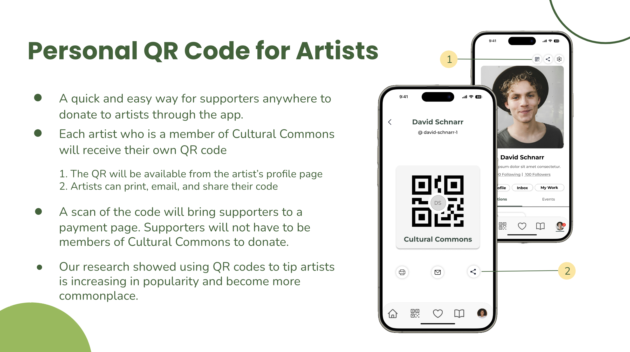
We learned that using digital fundraising platforms to give is growing. Our research showed that giving via QR codes is rising, especially in larger metro areas such as Atlanta and Nashville, where performing artists regularly display their QRs at events. (visual stat bubble on digital fundraising)
One of our key findings was the versatility of QR codes, which can be either static or dynamic. Dynamic QR codes offer the unique advantage of allowing users to track analytics. This feature could prove particularly beneficial for Cultural Commons, a new organization that may wish to refine its promotional approach based on this data. This finding underscores the practical implications of our research for Cultural Commons' fundraising strategy.
Competitive Analysis
Next, our team conducted a competitive analysis on seven platforms to see what existed in the problem space. While we didn’t find any direct comparables, three mobile apps had features we could use for inspiration and feature ideation: Nextdoor, GoFundMe, and Patreon. These features afforded users the opportunity to explore and share events in the community, donate funds to fundraising campaigns, and to showcase their artwork on a digital platform. Later in the project, we encountered several other apps with more similarities that could be further researched: Picklejar Live, Tip Top Jar, Buy Me A Coffee, and ETip.
Directed Storytelling
We conducted directed storytelling sessions with both groups to learn more about pain points from our two user groups. These sessions taught us that artists often need help finding adequate opportunities to showcase their talents. They are usually underpaid for their work, and funding for the arts, such as grants, is often unreliable and unpredictable.
Community members are eager to enjoy and support the arts, but they often are unsure of the best way to do so. They strive to find local events and they are cautious about financial contributions, not wanting to give money without being assured all of the funds will reach their intended recipient.
User Goals
From this first phase of our research, we identified two primary user groups: the artists and the community members who support the arts. We then identified the user goals for each group.
Artist User Goals:
Earn a reliable income, so they can feel financially
Learn about and participate in local arts events so they can grow their network of supporters and opportunities
Promote and showcase their work so they can feel seen and relevant
Contribute to and support the local arts community as a whole so they can feel engaged with the local arts scene
“People want to give, they just aren’t sure how.”
- J.M., community supporter
Community User Goals:
Be able to find and attend events so they can feel the joy of experiencing the arts
Support artists directly with financial contributions so they feel generous
Feel good about doing their part to support the greater arts community by making donations to the endowment
Feel secure about where their money is going and that it is making it to the intended recipient
Design Goals
create user-friendly mobile features that connect local artists with opportunities to showcase their talents
design a platform to allow community members to donate funds to artists, and artists to in turn receive those funds
design allows for transparency of funds allocation within the app between the organization, the artist users, and the community member users
create a platform to connect local arts supporters with opportunities to be informed about and attend arts events around the area
Prototype
How will it work?
Architectural Diagram
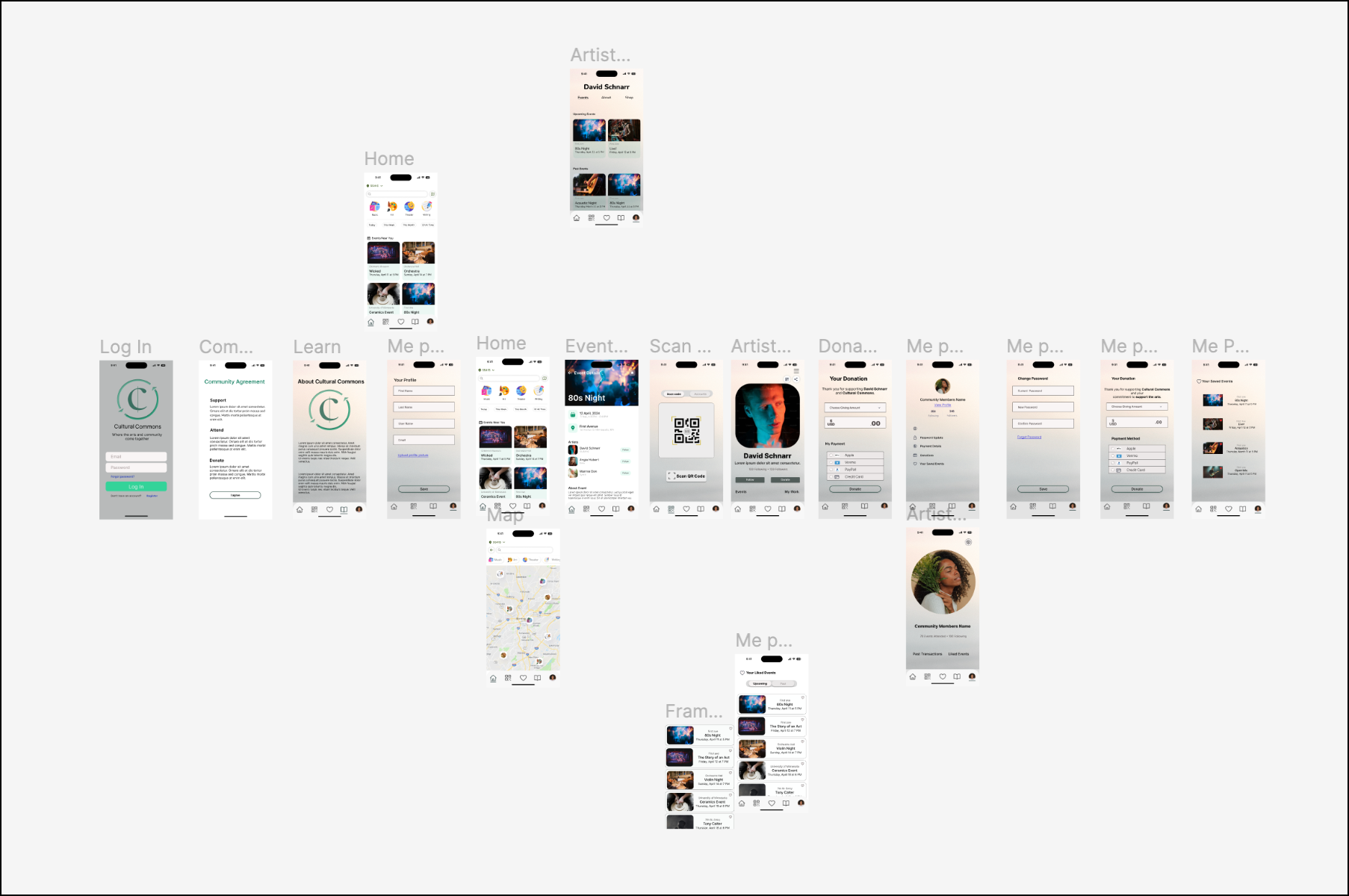
Because we identified two user groups for the app, we needed to create two different flows for the information architecture: one for the artist user and one for the community user. In our desirability testing, we learned that both user groups wanted to have the ability to peruse the site before signing up so they could feel assured that the site was legitimate and “worth it.” Therefore, we restructured our diagram and created a preliminary flow that allowed both user groups to browse the site for events. The sign-up process was triggered once they tried to save an event.
Mid-Fidelity
Once we had established a general idea of the architectural diagram, we began prototyping mid-fidelity wireframes to be used for desirability testing because we wanted to learn more about which features of the app would be the most meaningful to our two user groups, and to get feedback on features we may have missed.
We then moved to the evaluation phase.
Evaluation
What do users like?
Desirability Testing
There were two key findings from this desirability testing. The first was the importance of users building trust with the site and the organization before signing up for an account. They only wanted to log in once they had had a chance to browse. This was also the moment when our team began to understand users' enthusiasm about the prospect of actually realizing this platform; this was exceptionally motivating for us as a team.
“This is where it starts to get really exciting” - user, G.G. reacting to the app
The second key finding was that users valued transparency. They wanted to be sure they could see where the funding was going: how much was going to the organization and how much was going to the artists themselves. They also wanted to understand how the endowment allocates funds. These findings influenced our design choices in our next round of iteration.
I would want something to reassure me that most of the money was going to the artist. - user, G.G
(Re) Prototype
Adding Fidelity
Interactivity
After the desirability testing, we began to add interactivity to the frames. We revisited our architectural diagram in conjunction with our prototypes to make sure the flow made sense. We needed to make adjustments based on the fact that users wanted to browse the site before creating an account.
Design Rationale
As we increased the fidelity of our wireframes, we also began to make more intentional design choices based on information from our generative research, as well as client and user feedback. We began to implement a revised overall aesthetic that was more aligned with the modernist, proletariat vibe the client had envisioned. As a team, we had frequent, productive discussions to hash out the best ways to layout pages and add functionality. In order to capture all of our rationale and share it with our client, we created annotated wireframes.
Re (Evaluate)
What did users think?
Usability Testing
Once we had added enough interactivity to allow users to click through critical features, we conducted usability testing with five users: three for the community flow and two for the artist flow. The feedback we received was overwhelmingly positive. Suggested improvements we received were primarily related to accessibility, such as ensuring all text and icons were large enough and had enough contrast to be visible to everyone. These were good overall reminders as well. We implemented those changes and then increased the interactivity on the artist flow so the client and potential users could get a feel for how the app would function and look. Access the app from this LINK, or interact with the embedded prototye below.
Prototype of Cultural Commons Mobile App
Artist Flow
Next Steps
If proceeding with this project, I would…
• work to build out the calendar feature , since users suggested that being able to sync with other calendars would be really useful
• add more interactivity to the community flow, so we could get additional feedback from that user group
• add the ability for community users to share artist pages and events. We missed this feature during our design process, and it would be good to add it now, as this would support artist and organization goals of increasing visibiity and support
In Retrospect
Communication and Vision
One of the more significant challenges we faced as a team was establishing our design system early. After building out mid-fidelity wireframes, we realized our interpretations of the client aesthetic differed. We had to realign our communications and return to the research space to rework our overall aesthetic for the site. Ultimately, this proved an advantage because the end product was closer to the client's original vision, and in our usability testing, the design elements were rated as successful.
As for the client, we were so pleased to receive glowing feedback on our app. It can be challenging to take an idea someone else has envisioned and bring it to life in a way that matches the imagined outcome. Being able to help bring someone's vision to life is exceptionally rewarding; being a part of something meaningful, with the potential to grow and positively impact a large number of people is even more so.
Previous Case Study
Top of Page


